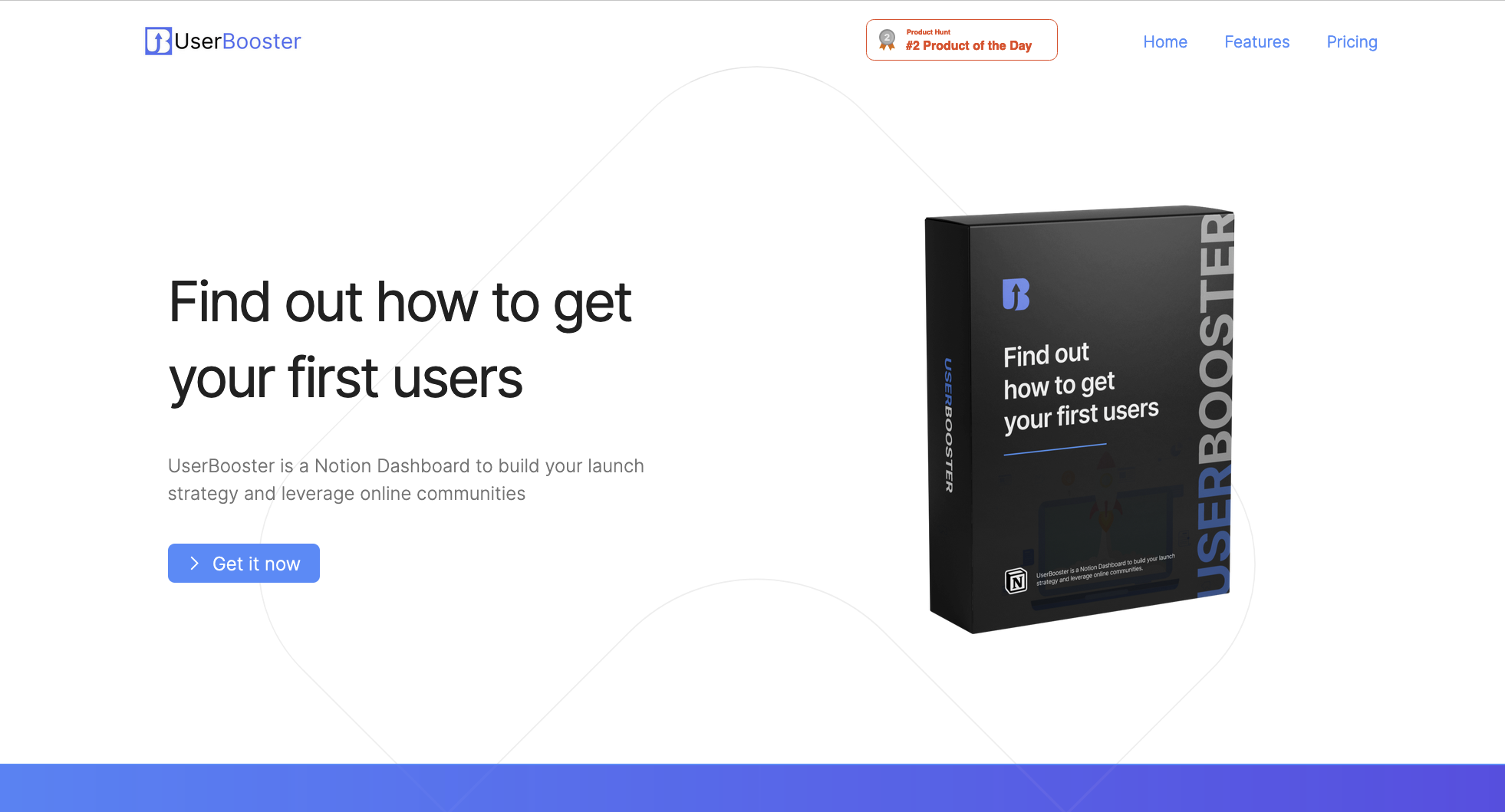
Last month I asked for help on Twitter. I wanted to hire someone to make me a nice visual for Userbooster. I had a ton of comments on that tweet, including many pieces of advice about how to improve my landing page. I chose to try some of them, which exceeded my expectations! I just doubled my conversion rate with these small changes on my landing page.
The experimentation
The conversion rate on my former landing page was pretty basic:
One visit was one dollar in my pocket at the end of the month.
Of course, it was not that precise, but this simple formula worked for months. The protocol to measure the impact on my landing page conversion rate was simple. I choose a few recommendations and implement them. Then I didn’t touch anything for a month and waited to see the results.
Here are the few changes I made that doubled my conversion rate:
1. A stronger identity
I made two things on the home page that makes it feels more professional.
A nice visual
That is why I asked for help on Twitter in the first place. I wanted a nice visual to show (primarily for Notion marketplace). Quentin from NotionEverything was super friendly and made this incredible visual for me, and for free! It makes UserBooster way more professional!
A logo
When I launched UserBooster, I used the rocket emoji as a logo. It was fine for the early days. I even kept it for my ProductHunt launch.
But when Medi made me this logo and the mockups, I was instantly convinced! I replaced all the emojis on the page and added the logo everywhere. It makes the brand way more consistent and has helped in the seriousness of the page.
2. Create trust
Add a navigation bar
The last thing I added to the landing page is a navigation bar. The website is a one-page, so a menu isn’t mandatory, but it reduces the visitor’s confusion. You know right away that UserBooster is a product with the ‘Features’ and ‘Pricing’ links. It removes the uncertainty and helps to convert better.
Reinforce social proof
UserBooster was the #2 product of the day on ProductHunt. I hid the badge somewhere in the footer. That was a BIG mistake. It’s now in the header and the footer. It brings a ton of credibility to the product. I was a fool to hide it for months.
3. What’s next?
I wanted to implement only a few changes and continue to experiment in the next months. Tom Fallowfield was super helpful for these! Here are the things I’m going to try in the next few months:
Improve the copywriting
There are two things I need to improve in particular: Talk more about the benefits. I’m still talking a bit about the product and its features. I need to talk more about my customers. Change the header to get the: “Oh, I’m in this situation!” effect. The current header is too vague and not enough about my customer problem.
Move from one page to a multi-page + blog
One page is the most straightforward website you can think of. It’s super easy to set up (especially with Carrd), but now that UserBooster is “mature,” it deserves an actual multi-pages website and a blog!
Remove the Notion-related jargon
A lot of my copywriting is about Notion, and it comes with a lot of jargon. Notion is still super niche, even in the startup ecosystem. I’ll try to remove all of these.
That’s pretty much for now, I will continue to make some experiment and will keep you posted for sure!
If you enjoyed this post, subscribe to my newsletter to get weekly tips ↓
